
Exodus.io
Exodus.io
Cryptocurrency wallet looking to improve conversions.
The Exodus product functions as a digital wallet enabling users to send, store, and receive cryptocurrencies. With so much competition in the space, it’s imperative that the company website appeals to potential users spanning a range of awareness levels about the product itself and cryptocurrencies in general. In order to optimize download conversions for the company’s product offering, applying a user centered design approach based on research is of the upmost importance when redesigning layout and rethinking content.
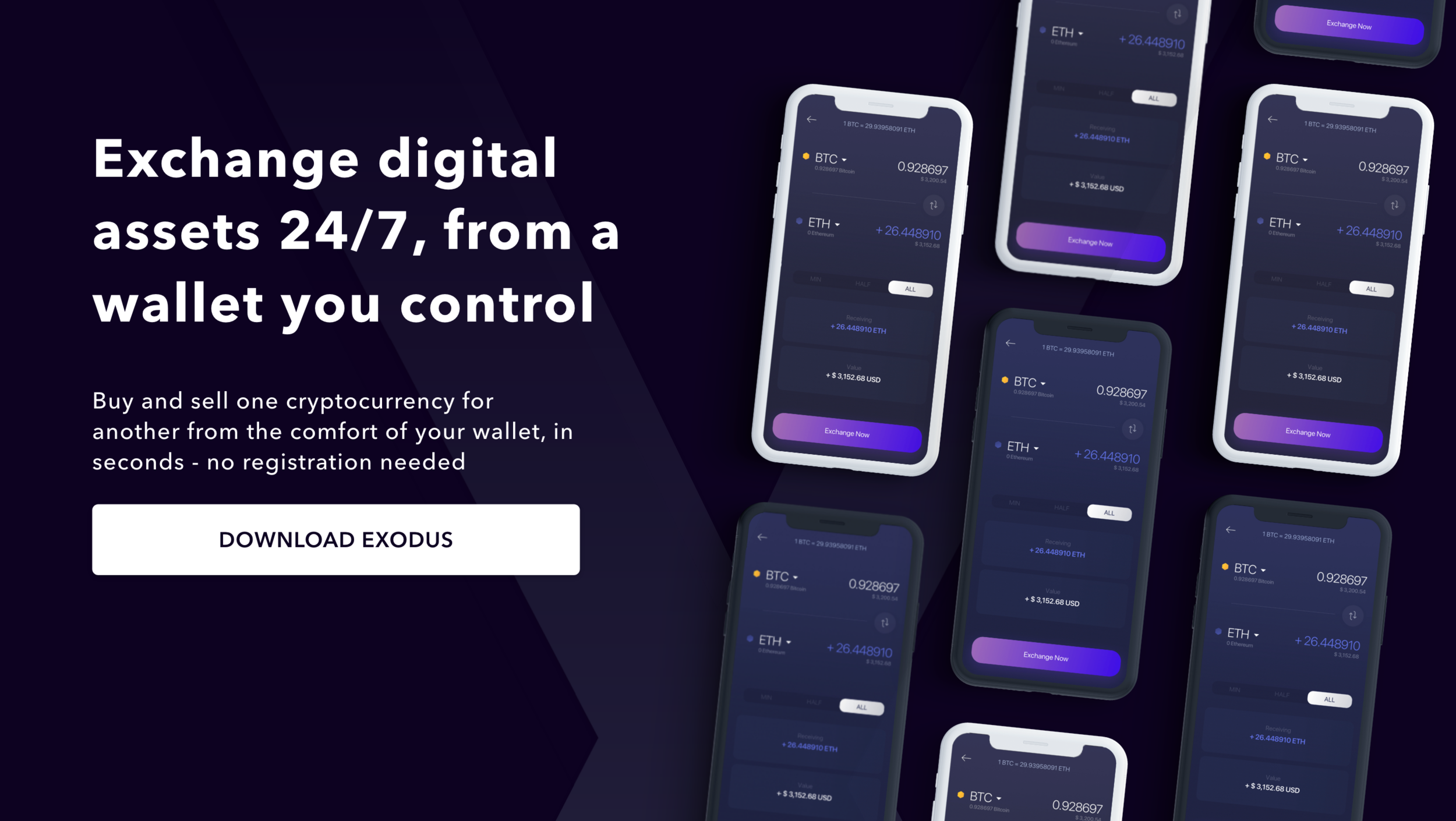
Project Brief
Project Goals
1) Dynamically change content based on browser to maximize respective desktop/mobile download conversions.
2) Increase cohesiveness of content on landing page focusing on value proposition and differentiation from competition.
3) Demystify technical jargon for inexperienced crypto users.
4) Create separate pages for content/sections that are presently on landing page that don’t help users reach end goal.
Responsibilities
Role: UX/UI Designer, User Researcher, Prototyper
Project type: Website Redesign
Platform: Desktop and Mobile Responsive Layout
Tools: Pen & Paper, Adobe Photoshop, Adobe XD, inVision

Approach
To gather insights on the current Exodus experience from existing users, users of competitor platforms, and non-crypto users with focus on motivations, values, and anxiety’s towards product.
Research Methods

• User Interviews
• Market Research Analysis
• Persona Building
• User Journey
• Information Architecture
• Prototype Testing
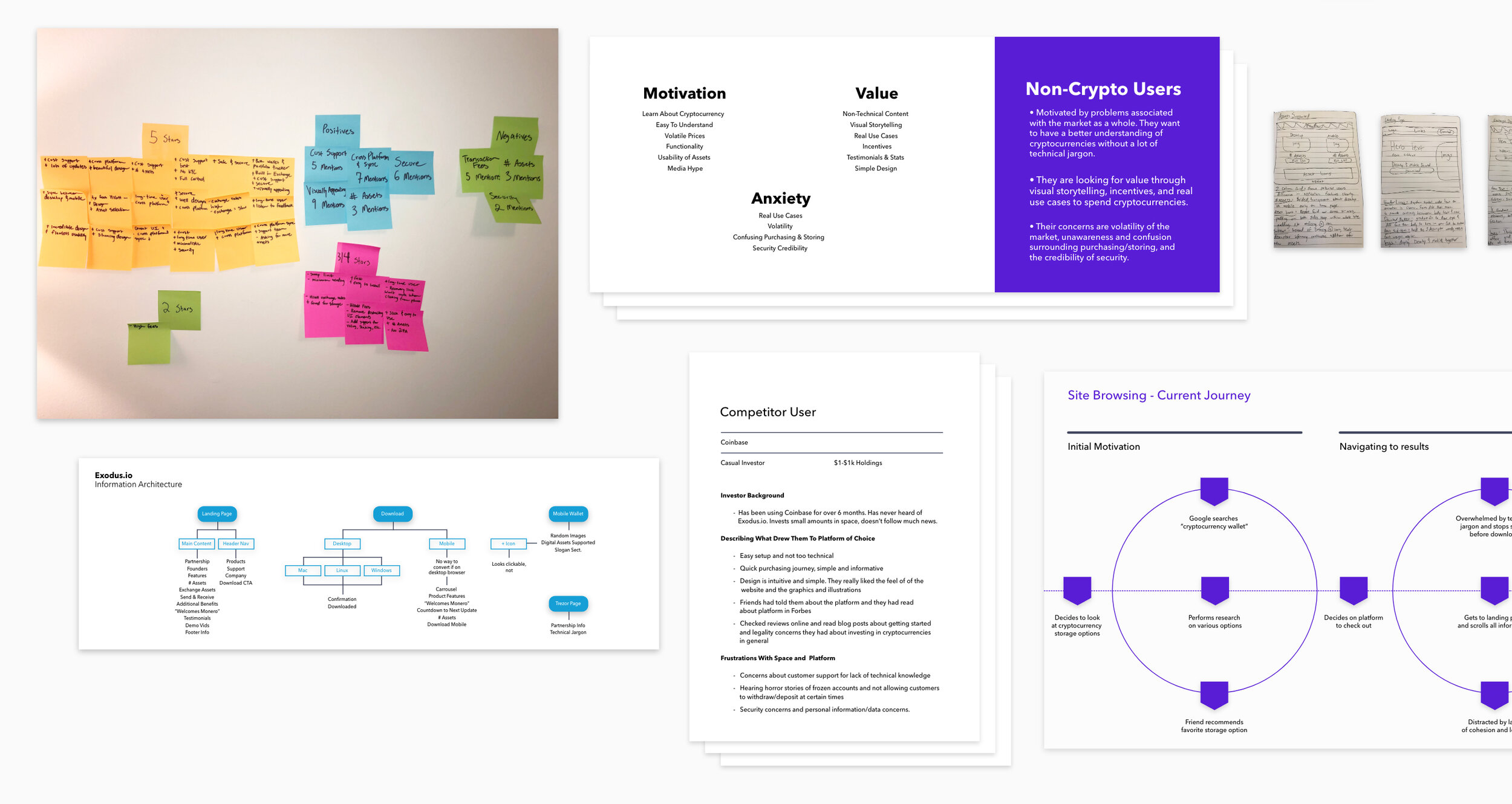
Customer Mindsets
On synthesizing customer research we could define 3 key Exodus users
The Futurist
“I’m in it for the long-run. I can’t wait for ETH staking. Decentralization!”
The Futurist follows a ton of cryptocurrency subreddits and actively engages in the community. They have read a bunch of whitepapers and have been invested since 2016. They care about cross-platform synchronization, security, UX, and low fees.
The Lottery Ticket
“I’m going to buy some Bitcoin because my friend said it’d make me rich one day!”
This user doesn’t necessarily know or care about technical components of cryptocurrencies, follow news, or rave to friends about future use cases. They are interested in investing a small amount just in case it takes off and can make them some money. They care more about ease of use, design, and customer support and not so much about security or additional features other than ability to buy and sell.
The Skeptic
“I’m not sure if this internet money is going to be the death of the economy or a genius idea, but either way I don’t trust it.”
The Skeptic has done some research on the cryptocurrency landscape as far as reading news articles, listening to podcasts, and reading about technical components, but holds anxieties in putting money into them. They care about security concerns, ease of use, and customer support.
Prototyping
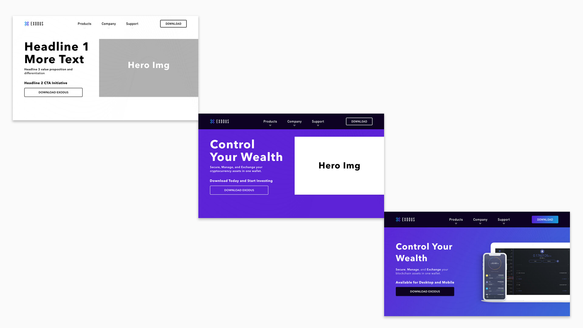
I went from hand sketched initial wireframes to a lo-fi clickable prototype using inVision to aid in user conversations and also provide usability insights A/B Testing content.
Content Iterations (A/B Testing)

Fidelity Evolution
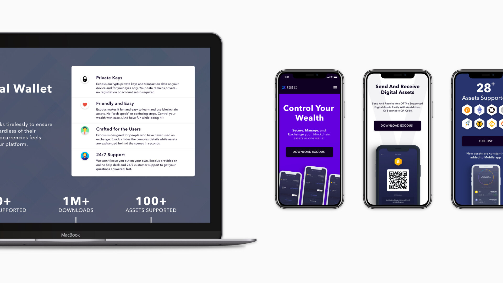
Defining the MVP
After making content and UI iterations during the research and testing phase, I was able to settle on a landing page layout effectively communicating the products value propositions and differentiation while eliminating technical jargon and distracting elements. Using Adobe XD I was able to take the prototype one step further implementing subtle interaction and dynamically changing content for Mobile.
Increasing Cohesion
During the research and iteration phase it became apparent that the initial landing page had a lot of unnecessary content distracting users. Since the main business goal was optimizing download conversions, restructuring content was important.
Founders Page
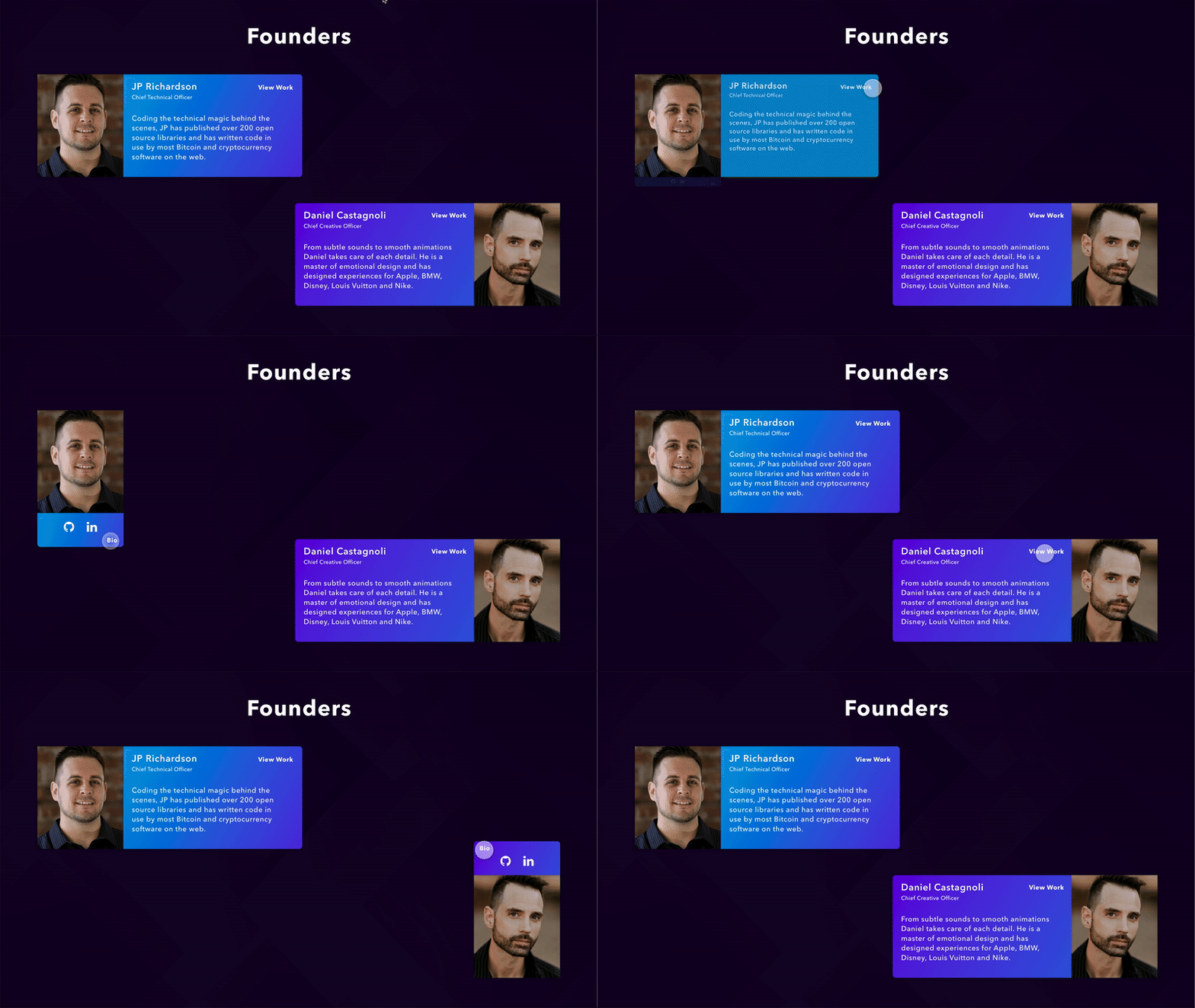
On the original landing page, the Founders section was right below the fold taking up crucial real estate for product value proposition information and competitive differentiation opportunities to get website visitors to convert to users. By crafting a dedicated Mission & Values Page with the Founders displayed in a visually appealing way, their accolades and achievements add credibility and trust and don’t distract users on the landing page.
Assets List
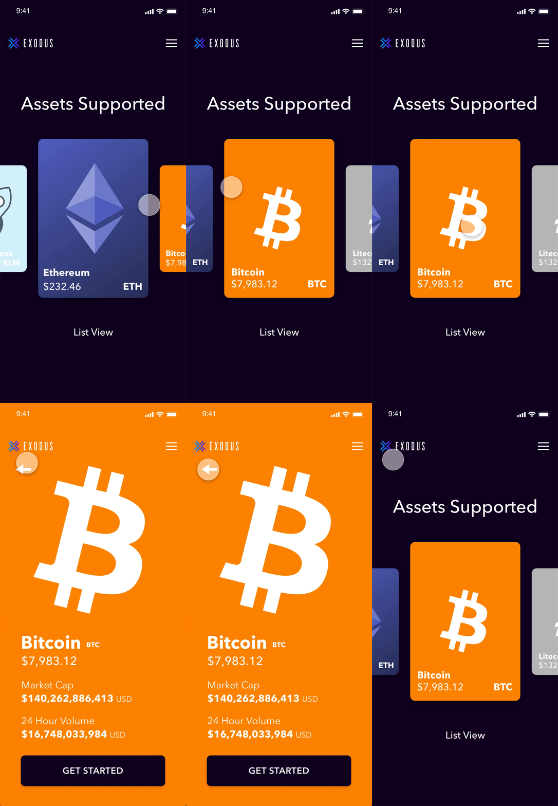
On the original landing page on both desktop and mobile, there was a table breakdown of assets for the product. This table was unnecessary as every column/box had a checkmark for each asset making no difference between assets and not adding any relevant information for novice potential users. By adding a dedicated carousel like assets list for Mobile, potential users could interact effortlessly with and learn about various assets on the platform.
Learnings
Less is More
When designing for a highly technical and often misunderstood industry/product offering, it’s extremely important to educate users through cohesive content that naturally flows. By focusing on main value propositions and not adding extra technical jargon/features that only cater to select few potential users on landing page, higher opportunity to convert on downloads by keeping things simple and not overwhelming.
Don’t Make Assumptions About Users
When conducting user interviews, it became apparent that motivations, pain points, and values people were looking to address in a cryptocurrency wallet platform were very wide ranging. Even those who had been invested in the space for years were drawn to different platforms for very different reasons. It was obvious that talking to as many people as possible was crucial in building out relevant content and copy to cater to these various needs.